Real nutrition, made simple.
Social
You are what you eat. Choose wisely. Before introducing the product, we focused on building relevance. The pre-launch social media strategy was rooted in education, creating content around gut health, plant-based nutrition, antioxidants, vitamins, minerals, and the everyday importance of eating well.


The objective was to make the audience care about the subject before asking them to care about the brand. Once Green Ahara launched, the content shifted from education to connection. We brought in real conversations, real perspectives on health and consistency, and the founder’s voice to ground the brand in honesty and intent. From there, the communication gradually introduced the products, their benefits, and the role they could realistically play in everyday life.


graphics & packaging
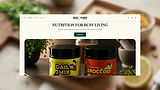
The cleanest thing on your plate starts here. While the website leaned into calm and restraint, the packaging was designed to do the opposite. It was vibrant, bold, and full of energy by choice. The intention was to make Green Ahara stand apart from the visual sameness that often defines the health category.

The branding was built to speak to a younger, design-aware audience without losing the product’s integrity. The logo brought that attitude together in one clear mark. The green, black, and white palette gave it contrast and clarity. The extended N suggested growth, while the embedded smile brought in ease and accessibility. The typography added a playful, confident tone that made the brand feel fresh rather than clinical.


Eat clean. Live loud.
The colour system brought together two distinct energies. Green anchored the brand in wellness, nature, and its plant-based core. Maroon introduced depth and contrast, giving the brand a more unexpected and contemporary edge.
The typography followed that same logic. It carried a sense of energy and individuality, helping the brand feel expressive, recognisable, and distinctly its own.
Color palette & typography
Lorem Ipsum is simply dummy text of the printing and typesetting industry. Lorem Ipsum has been the industry's standard dummy text ever since the 1500s, Lorem Ipsum is simply dummy text of the printing and typesetting industry.


Lorem Ipsum is simply dummy text of the printing and typesetting industry. Lorem Ipsum has been the industry's standard dummy text ever since the 1500s,
website
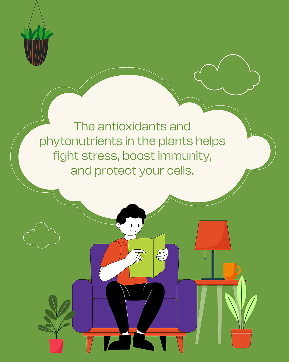
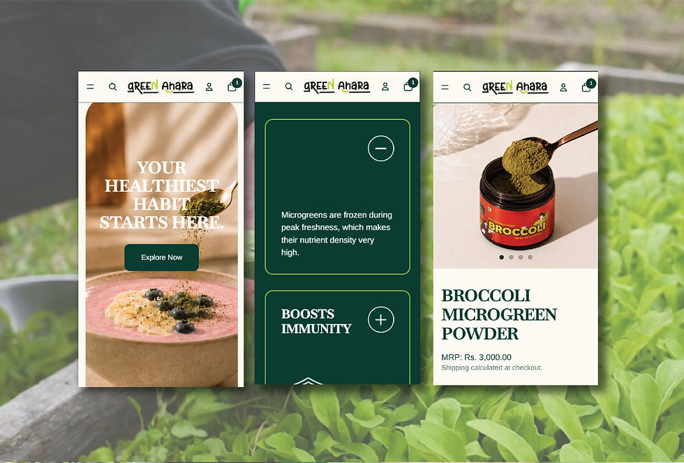
Green Ahara was built on a straightforward belief: food should not feel complicated. Beginning with microgreens, naturally rich in vitamins, minerals, and phytonutrients, the brand set out to offer nutrition in its cleanest, most usable form. Grown with intention, harvested at the right stage, and freeze-dried to preserve integrity, the product was rooted in simplicity and substance.
Every design decision traced back to the founding idea. The typography reflected clarity. The shades of green connected back to the diversity of the product itself. The white space reinforced the sense of balance the brand stands for. Nothing was there without reason.

The website was designed to reflect that same philosophy. Minimal, clear, and immediately trustworthy, it created a visual environment that felt light and composed. Soft greens paired with white gave the brand room to breathe, while subtle character illustrations added warmth and relatability across age groups.