
Built to lead. Designed to last.
graphics & packaging
A mark that means business.
The identity was built around clarity. Minimal in form, strong in presence. Every element was carefully considered, including what to leave out.
The dot after KT was intentional. More than a visual detail, it added distinction and meaning to the identity. Its separate colour gave it emphasis without making it feel forced. The result was a mark that feels controlled, confident, and memorable.
Blue was central to the brand from the start. It brought authority, stability, and a sense of scale that could work across every touchpoint. The green dot added contrast and character, subtle enough to support the identity without distracting from it.

.jpeg)


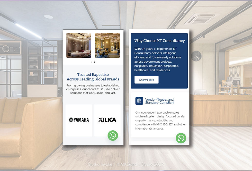
On the website, white became the dominant tone, giving the brand space to feel clean, refined, and accessible. Paired with typography that carries weight without feeling heavy, the system was built to reflect the same quality KT Consultancy represents: assured, modern, and globally relevant.
website
KT Consultancy operates in a category where precision, trust, and authority are expected. From the first brief, their intent was clear. This was not about creating just another digital presence. It was about establishing a company built to lead in India and across global markets.

.jpeg)
The website was designed with that ambition in mind. Clean, minimal, and immediately clear, it was built to communicate credibility without overstatement. The goal was to ensure that any visitor, from any market, could quickly understand what KT Consultancy stands for and feel the strength behind the brand.

.jpeg)
Every layout, visual choice, and interface decision was made to position KT Consultancy as a company with presence, clarity, and long-term relevance.