top of page

Design that makes healthy feel desirable.
website
Simply Salad came to us with a clear challenge. Salads are often seen as an afterthought, a compromise, or a health decision people make reluctantly. The brand wanted to shift that perception and make people genuinely crave the product.


The visual language was clean, warm, and approachable. The UI was designed with soft, rounded forms to feel intuitive and inviting, speaking to a broad everyday audience rather than a narrow health-first niche. Simply Salad did not just want to sell salads. They wanted people to want them. That difference shaped the entire approach.

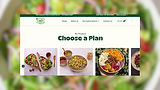
Our work across the website and performance marketing focused on sensory storytelling. The goal was not just to communicate freshness, but to make it feel immediate and appealing.
ACCOUNTABILITY. TRANSPARENCY. COMMUNICATION.
bottom of page